Favorite Finds Friday - A Bedroom Update

Okay, for all you newbies out there, I should first tell you, I tend to like more masculine pieces. This works out GREAT for design decisions in my house, but I know a lot of you out there would love to know how to get what you want in your room designs as well as make your significant other happy. WELLLLLL some clients I’ve worked with have the best husbands who really don’t care how many throw pillows are on the bed, or what is floral or ruffled, but those are few and far between!

Thankfully, I have a few designer tips for all of you out there trying to appease your stubborn husband with new decor ideas!
1. The fewer the better. This approach works best with anything decor related. Number of throw pillows? The fewer the better. Decorative accents? The fewer the better. Art or Framed memories? Same. The fewer the better.
2. Colors and Texture should be most prominent. I suggest keeping patterns down to a minimum, but add in layers of texture. In the Friday Faves below, I have soft pillows and blankets, and added in woven baskets for planters.
3. Function over Fluff. You can convince your significant other of your design selections if there is a need. In the design below, I selected pendant lights over nightstands. Forget the decorative lamps surrounded by a picture frame and a floral arrangement, these pendant lights will do the trick AND look gorgeous.

 
Favorite Finds Friday, a bedroom design featuring ways to update your bedroom with some colorful and funky mid-century modern pieces with masculine lines. All products have shoppable links to purchase this look. How to update your bedroom.
 
  1. Bed

  2. Pendants

  3. Throw Pillow

  4. Throw Pillow [Out of Stock]

  5. Throw Blanket

  6. Area Rug

  7. Baskets / Planters [Similiar]

  8. Faux Tree [Similar]

3 Ways to Style a Foyer

Hey Guys,

First impressions are everything. Whether it is meeting a new friend, the future in-laws, or an interviewer, we all know to put our best foot forward. We look the part, we act the part, and we want to show our amazing personalities. So why not do that with our homes, more specifically, our foyers?

This whole How to Style a Foyer series came about when I went to my friend’s house. Before I continue with the story, I have to tell you, I’m constantly convincing my friends and family I’m not judging their interiors. I certainly don’t have a perfect home or keep a perfectly neat house, but my friends feel the need to apologize to me for the mess or lack of décor. We can call that a designer’s curse.

Anyway, I walk into my friend’s home and she instantly apologized, told me she knows she needs to do something in her entry, but had ZERO CLUE where to begin. I was honestly shocked! The designer in me knows it is hard for some people to finish styling a space or envision how something might look, but we are constantly being shown beautiful homes. How could someone not be able to pull inspiration from Pinterest, TV shows, commercials, magazines, and other houses? So I instantly start spouting out option after option of potential ways to style a foyer. Her eyes instantly glazed over with that feeling of too much to narrow it down. I told her I would get together a couple foyer solutions I love and show how I would style the space. Not wanting to charge for design or make her feel like she needed to purchase what I suggested, I told her I would turn it into a blog series! Win – win – win!

Whatever you foyer size, you should have a place to plop things down, put on shoes, and most importantly - show off personality. A good design hits the following 3 criteria: Personality – Budget – Function. So I went ahead and designed 3 different ways to Style a Foyer (semi-budget friendly too). Yes, I could have styled a foyer table 3 ways, but how a foyer functions is more important than trying selecting decor. Did we want a mirror and table, did we want statement art and a bench, or did we want a place to hang coats and put on shoes?

How to style a foyer option 1 – Console Table, Mirror, Wall Scones, and decor a shoppable look Style and Design, All Online E-design with Manda at Interior Style Studio. Looking for 3 really different ways to style a foyer? Check out the blog post f…


Foyer 1:
Find a mirror that just makes a statement. This one is from Uttermost and has a really unique frame design. Next up, find a foyer table you think rocks – I loved this simple-lined one.  Then I found these sexy streamlined wall sconces. It was love at first sight and I instantly stopped looking (well, I scrolled down to the end of the page, but didn’t even bother hitting the next arrow). I have been obsessed with felt ottomans for quite a while now and these Design Within Reach ones do not disappoint! Once you have the bones, find a small floral, a couple books, and pop in a sculpture set! Call this one a day. Yes, you will need an electrician to hook up the sconces, but in my book, it is SO worth it! Not feeling a mirror? Maybe we should try art instead. . .

How to style a foyer option 2 – statement art, bench, area rug, and pillows a shoppable look This is the second option out of 3 ways to style a foyer. Check out the other ways to style a foyer with a console table OR coat rack. Dream Home Interior D…

Foyer 2:
Art can be everything to a space, but if you just have a piece of art hanging in your foyer, it might be feeling flat. If you have a large piece, I’m talking over 42” wide, try hanging it a little higher and placing a bench underneath. This photograph of Joshua Tree, taken by Wilder California made me stop dead in my tracks and inspired the rest of the foyer. If you love the art option, please make sure you START with the ART and not find the art to work with the pillows. Yes you can find art to work with the pillows you fell in love with, but my guess is you will be settling. There are so many pillow vendors out there, plus you can always make pillows if you can’t find exactly what you’re looking for. The next thing I searched for was the bench. Scale is first – make sure the bench is wider than your art. This modern leather bench in gray was perfect and I stopped again.  Stop looking when you find THE PIECE. Next up was this STUNNING hexagon hair-on-hide area rug.  It has so many tones in it and textures, it really ties the bench to the art – just make sure your guests don’t wipe their feet on it! Lastly select the pillows and a blanket. To select the best colors for the art, my best tip is this: squint at the picture. When I squinted at this Joshua Tree print, I saw blue, green, and beige with a hint of flesh tones. Went to my favorite pillow vendors and found these beautiful muted options. Finish the bench off with the blanket. I know, I know, no one will even use this blanket, but it helps to anchor the décor. Maybe one day it will be used as a quick wrap-up to answer the door, but I bet it will more than likely just sit there and look pretty.
 

How to style a foyer 3 – coat rack, art ledge, and bench a shoppable look This is the third option out of 3 ways to style a foyer. Check out the other ways to style a foyer with a console table OR Statement Art. Dream Home Interior Design Tips, How …


Foyer 3:
This is your go-to option if you need to fake a foyer, have a small foyer, or have a family / dog. I started this foyer by selecting the perfect coat rack system and found a picture ledge in the same size to make a custom look. The bench and ledge are from the same company, and are powder coated in this Ocean Color. For a catch-all, find a couple baskets and toss them under the bench. Select fun art to reflect your personality, and don’t forget a black and white photo from your life. Mine is my Doxie, Luna – looking all crazy like a fox! When layering art on a ledge, make sure you mix and match the frames – a matching set is so boring. Punch up the space with a couple pillows and call this foyer a day!

To shop the look, use the following links below:

Foyer Pop 1:
Sconces $740 each
Mirror $324
Console Table $559 on sale at Wayfair RIGHT NOW
Small Floral Arrangement $251 When it comes to faux flowers, you totally get what you pay for!
Book - Chic Stays Only $58 from TARGET!!
Ottomans $295 (color shown is aqua)
Sculpture - $84, back in stock December 4th

Foyer Pop 2:
Art 54” x 40” with an upgraded Copper Frame and white border. (Add a mat for an extra $100, change the frame, or pick a different size)
Pillow 1 20” x 20” $96 (Insert not included)
Pillow 2 12” x 20” $68 (Insert not included)
Blanket (Exact one is Out of Stock, but I’ve attached an almost identical one from the same vendor)
Bench (No longer available, send me a request and I’ll send you some close alternates)
Area Rug (Price depends on the size, but you can look to spend around $1k here. No shoe prints on this one!!)

Foyer Pop 3:
Ledge $89
Coat Rack $75
Art 1 - Lines
Art 2 - Stairs
Art 3
Pillow 1 - No longer Available
Pillow 2 - No longer Available
Bench 48” wide, $500
Baskets - No longer Available

A Manly Bedroom E-Design

Masculine Bedroom Design for one sexy looking Master. Alright guys, yes you Bachelors out there, you need a great space too! Shop the look to this master bedroom by following the link to the blog. How to style a bedroom, e-designer, virtual interior…

Hello Design Lovers,

This one is for all the men out there – Unless, you’re say, like me and love a masculine design more than white shiplap and pink décor – then you will love this one too!

I love working with women to design a bedroom retreat, and most of the women I work with have husband who just really need to sign off on the design. Usually that means not too much pink, and compromising on mirrored items or how many throw pillows a bed can take! HA! So this Master Bedroom Design was fun to work one-on-one with a single guy. He wanted his master bedroom to feel luxurious, give off some sex appeal (are you laughing yet, because I still can’t help but giggle) and to be comfortable for entertaining.

So what does “Sexy and Sleek” mean to a designer? Well, I can’t speak for all designers, but THIS GIRL has some major thoughts on it! Dark walls with deep saturation anchors the room with a dramatic feel. Then add in some animal hides, horns, furs, and even faux taxidermy to the wall for a manly statement. The sleekness comes into play with the brass accents and clean lines. The bed is very linear, the nightstands have linear carvings on them, and the dresser has the same linear element.

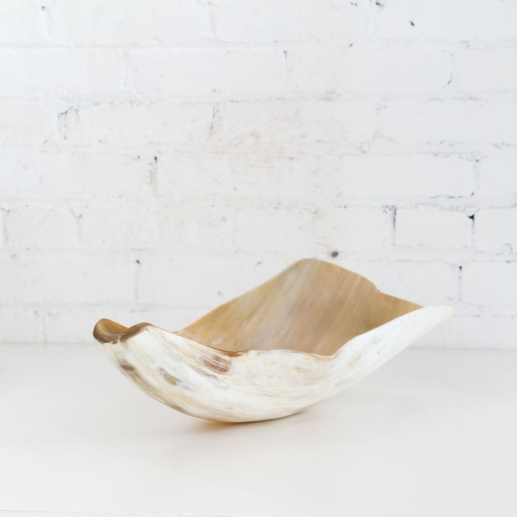
Lastly, I know most men do not care about displaying décor, so I stuck with a few planters for succulents, a leather catchall tray for the nightstand, and a horn bowl for the dresser. Then the room was finished off with a brass light fixture (with adjustable arms), some Aztec inspired pillows and a blanket.

eames lounge.jpg

But, again, if you know me at all yet, my FAVORITE part of the design is that GORGEOUS and SUPER SEXY Eames Lounge Chair in black leather and a walnut shell. (The Palisander shell is also show-stopping)

Take a look at the shopping list below, and if you would like me to shop for you or design a room of your dreams, check out how affordable the plans are, by clicking here. I designed this room in June 2017, so some of the items are no longer available so only the available product is linked. 


The Bed $1,898 in a Queen

Leather Tray $45

Planters $65 (wait list)

Eames Lounge Chair and Ottoman As shown - $7,095

Nightstands $398 each

Dresser $1,198

Blanket $275

Dwell with Dignity and Wisteria Contest

Soft feminine living room design with links to purchase.

If you aren’t familiar with Dwell with Dignity, they are a wonderful charity which helps families escape poverty and homelessness through design; one household at a time. To read more about the company and their amazing success stories, click here.

They were founded in 2009 in Dallas, TX and now have a location closer to me in Atlanta. They have completed 97 homes so far, and you NEED to go see the faces when the home is revealed. Kinda like the wonderful / amazement you got to see on that other show – Extreme Makeover Home Edition. They do it in a more realistic manner, but you get the point.

If you aren’t familiar with Wisteria, they are a home decor company located in Dallas, TX with a store front and online store selling treasured finds to give your home personality. To read more about the company and their story, click here.

So by now, I know I was not selected as the 1st round winner, but they will select 3 other wining boards throughout the year. Since I wrote this over a year ago, you cannot shop the looks simply by clicking on their website, so I have added some of the products which are still available for sale. 
 

This Area Rug is available in multiple sizes so you can find the perfect one for your home!

Decorate your coffee table with these Bud Vases - also perfect for a console table or dining room

The Pink Dahlia Wall Art is what inspired the whole room! The matching art is available

This Moroccan Mirror is a show stopper - perfect for bathrooms or over a console table like I used in this design. 

Glass Waterfall Tables are the perfect solution to make a room feel larger - - they don't take up any visual space! (If you have kids, I would recommend an acrylic table JUST IN CASE)

The Flax Blue Pillows add such a soft elegance and are available in square, rectangular, and kidney shapes!  

This Console is one of my favorite consoles ever! The top drawers are the perfect depth for remotes and you won't be rummaging around to find whatever you threw in there!

A Crystal Lamp always makes such a beautiful statement! This bad boy is 32" High, take THAT you other short lamps! (plus my dog's name is Luna, so it is extra special to me)

This sectional is the most expensive item, but when it comes to picking a sofa, you can't cheap out. If you do, you would just have to purchase another one in two years. 


Start with Art Contest

Inspired by: Miru Kim, Manhattan Bridge, New York, NY, USA 

Inspired by: Miru Kim, Manhattan Bridge, New York, NY, USA 

Twyla held a design competition to get designers to be inspired by artwork and start by designing a room based on the art. I decided to enter because the grand prize was a trip to NYC and 5 finalists would get a work of art – worst case I would wind up with something to post!

Miru Kim's Artwork

If you aren't familiar with Twyla, I encourage you to take a look! They have an amazing curated collection from super talented artist! While there is definitely a place for artwork from larger vendors, having a limited print will make your room feel so much more special! SO I hopped on their site and was immediately drawn to the colors and juxtaposition of the bridge and the artist (it may be a little like where’s waldo, but you can find her).

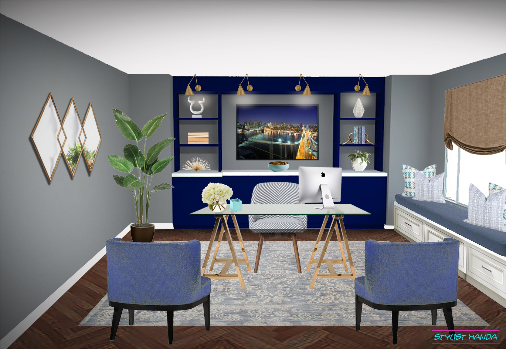
SO I had the art. Now what? What kind of room did I want it to go in? Who was this imaginary client and why would they pick this artwork to feature in a room? I figured this client would be a lot like me :D They have a home office, are in their 30's and want a feminine vibe, but without PINK. I decided to create custom cabinetry as a back wall credenza to display fun decor on open shelves and the middle would frame the amazing work of art. From there I found furniture and decor which not only coordinated with the colors from the art, but also symbolized strength and femininity.

I created this look in Spring of 2017, so some of the items are no longer available to purchase so I removed the ones you can no longer purchase, but left the prices. Shop the look below:

Sconces $430
Horn Sculpture $120
Gold and Cork Vase $55
Cast Linked Bookends $225

Desk $1,398
Desk Chair $349
Pen Cup $6
Floral Arrangement $175
Tulip Roman Shades
Area Rug